
CASology CUE Card #79: Contrast!
WOW, this is going to be an interesting treat!
This week we are all showcasing a CLEAN and SIMPLE card,
and another card that we have made that is NOT CLEAN And Simple.
I currently do CAS and NON CAS, so this isn't that big stretch for me.
I selected my inspiration from my entry card I just made for the current FESTIVE Friday challenge.
The card I first entered is what I like to call layered and lavish.
So here are both cards!


Have FUN creating, and VISIT each Designer to see how they have a Contrast Card, and the card posted on the CASology Blog!


WOW, this is going to be an interesting treat!
This week we are all showcasing a CLEAN and SIMPLE card,
and another card that we have made that is NOT CLEAN And Simple.
I currently do CAS and NON CAS, so this isn't that big stretch for me.
I selected my inspiration from my entry card I just made for the current FESTIVE Friday challenge.
The card I first entered is what I like to call layered and lavish.
So here are both cards!
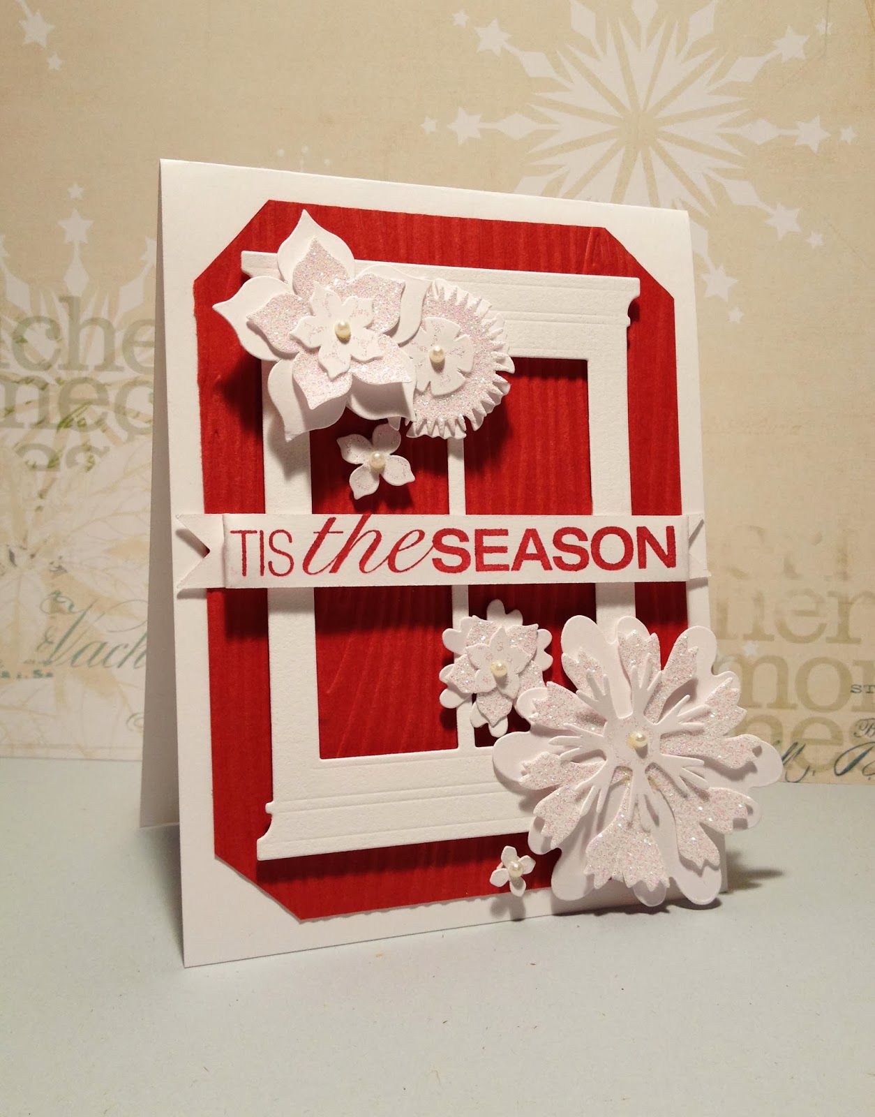
CONTRAST:
CAS
Here are the differences that make the card on the right CAS,
and the one on the Left, NON CAS.
- Lots of OPEN unfilled space.
- MINIMAL embellishments
- ONE Layer cardstock
-Sentiment on SINGLE layer carstock
-EASY to recreate
-QUICK to make
NON CAS:
Here are the differences that make the card on the left NON CAS
-The space is FILLED
- MULTIPLE Layers of cardstock, embellishments and banners
- The embellishments have MULTIPLE layers
- SEVERAL embellishments cover the page
-- The sentiment is LAYERED on a banner atop more LAYERS
-NOT EASY to recreate, several layers and types of embellishments make this a unique card
that would be challenging to recreate
A LONG time would be spent to try to reproduce several cards made
with as many intricate layers upon layers and so may steps.
And just to give you an idea of how both designs came to be, here is the current Festive Fridays challenge Photo Inspiration:
Posting to Festive Fridays
Sponsor: My Creative Classroom
Prize: free seat to any online workshop class

Gorgeous demonstration of the difference between CAS and non CAS! And even using the same inspiration - well done! (and thanks for joining us at Festive Friday!)
love the contrast .. and the white and red combo is fantastic..:)
Love this! So helpful to have it all explained so clearly with examples to compare. Have to say I'm on the CAS side at the moment - think your CAS card is perfect!
I do both CAS and non CAS, too. I love both. What beautiful cards you made with your inspiration. Love that photo.
Such a fabulous display of contrast! Love how you used your previous (gorgeous) card, and re-vamped it to show how it's CAS cousin would look like (gorgeous)!! Perfect cards, perfect illustration :)
Zo mooi gemaakt! Translation: made it so beautiful!!!!
X !neke
Kimberly, two gorgeous cards that are definitely illustative of two different styles! I mist admit I LOVE the CAS version...that red just pops against all that white space!
Wow, Kimberley, what a great way to demonstrate CAS and non-CAS. Both cards are fabulous, although the CAS one with all that glorious white space sings more to me! Anita :)
Perfect take on Contrast! I like both but your more CAS one is just so perfect! Must be nice to be able to switch back and forth between styles so effortlessly!
Such great demonstration of the difference between CAS and non CAS. LOVE LOVE LOVE both your cards
Oh Kimberly these are so stunning, I love them both. The birds one... CAS perfection :)
Wow, you rocked this challenges. Both are gorgeous and a perfect demo of contrast.
You seriously rocked them...both of them! gorgeous fabulous work, as always!
Wonderful pair of cards, and great description and explanation of how they differ. The first one is gorgeous with all those layers, but I have to say that your CAS one stole my heart.
Kimberly I love both of your cards for the style they each represent. Have too say that your second version of the card is a perfect demonstration of CASification!
You are so clever, Kimberly! I love both cards and how well you demonstrated the differences between them! Love the striking contrast of red on a white background, too...Beautiful cards!
Two beauties Kimberly! Nice to see the contrasts in style!
Two amazing cards, and Kimberly, I'm going to have to try to do exactly this!...Make two completely different cards from one inspiration. Love them both, but the CAS one is killer!!! Wonderful. Bev
You ROCK both the styles. I love both of them to pieces.
Oh I love your examples of CAS and non CAS! I already loved the first card you made for FF and this one is equally lovely! Thanks so much for joining us at Festive Friday again :) heheh!
Hmmm... I might even like this one better Kim!!
And there you go again: educating and delighting us with your brilliant, clear explanations of the two styles/techniques. Truly, your talents are limitless! Layered and lavish, or cas, both cards are stunning! Love seeing the revamps!!
c
Thank you for the contrast comparison between CAS and lavished layers.
Kimberly, you knocked this out of the park. I love both designs! The sweet little window with the birds is fabulous. So glad you could play with us at Festive Friday!
Oh these are both SO well done! So glad you joined us at Festive Friday!
Post a Comment